Waterway Guide has maintained a strategic alliance with the mobile navigation app Aqua Map for several years. Subscribers to Aqua Map can view hundreds of thousands of data points in the app from Waterway Guide Media’s extensive repository of information. As a leading navigation platform, Aqua Map is engineered to contemporary and exacting standards with deep functional capabilities for boaters across the U.S. and international waters. The Aqua Map team works with dedicated on-the-water skippers to arrive at significant upgrades and features. The latest round of updates is impressive.
Aqua Map has now added a weather option. Before you think “so what?” because there are so many dedicated weather apps out there already, what could they possibly offer that’s not already available? Are they seriously going to compete with Windy or PredictWind? But the genius developers at Aqua Map have created a suite of updates that is truly exceptional. The app’s weather utility now offers: wind, waves, and ocean currents. Here are the details.
Wind. Aqua Map uses NOAA’s HRRR model for wind, which is an advanced prediction model from NOAA that’s getting great reviews for accuracy with a resolution of 3 km. Updated once an hour with radar inputs every 15 minutes, it predicts 48 hours out. The HRRR model is available only in and near the continental U.S. but within that window is reportedly more accurate than other models, especially with the hourly updates and 15-minute radar inputs. Wind is shown with arrows and a number for speed across the chart which can be easily turned on and off for clarity. A slider advances the prediction across 48 hours - which also advances any tide and current stations in view on the chart; handy for predicting wind against tide conditions at inlets. With a tap on any chart location, a pop-up appears with full weather conditions for that point and a sidebar with access to a seven-day general prediction. Also on the sidebar is a link to the textual NOAA 5-day coastal marine prediction, the same forecast given over VHF. Tapping the chart reveals the NOAA marine forecast specific to that zone.
Waves. Another selectable display is wave direction and wave height. This data comes from NOAA’s Wavewatch III. The 48-hour slider is used to predict waves, tides, and tidal currents as well – especially handy to see if you have tide against wind at inlets as you plan your transits.
Ocean Currents. A third selectable display is ocean currents, an innovation by Aqua Map, most notably the Gulf Stream. The predictions are from NOAA’s Global Real-Time Ocean Forecast System from NOAA. It shows current direction, speed, and even eddies. It comes with a 48-hour prediction slider and should be a favorite for those going to the Bahamas.
The three displays are color-coded for intensity with red being the most intense. The size and density of the display icons are selectable with a slider in the Settings menu as to whether you want to see numbers (for speed) for each icon on the chart or just a color code along with the directional icons matching a color-coded legend on the side of the display. All three displays cover the entire world but the wind display for the U.S. coastal waters uses NOAA’s HRRR high-accuracy model.
So, what dedicated weather apps have the same capability? PredictWind offers HRRR but their documentation indicates that it’s updated every six hours and does not display speed except at a single point with a tap. Windy does not offer HRRR at all. There don’t appear to be any other navigation apps that offer ocean currents.
See the screenshots below for details.

Fig 1 Aqua Map Wind
Tap on Settings and select Marine Forecasts to get the screenshot shown above. In the example, Enable Overlay is turned on, How to Display show Symbols and Labels (speed) chosen (blue outline box). Text & Icon Size slider is to the right (biggest), Icon Density on Map is set mostly to the left (sparse), and Show Legend On Map is turned on. The legend is the vertical color bar at bottom right with blue for less wind and red for the most with other colors in-between.
Most of the functions can also be controlled with just the icons on the chart at bottom right. The wind icon is presently selected (shows blue). A tap on that icon shows a choice of displaying wind, waves, or ocean currents so you can switch between them without having to go through the Settings menu. You will also note the new location of the Settings menu – parked at the right side of the display instead of in the middle of the screen – covering part of the chart. You can change settings in the menu and see the immediate effects on the chart display.
Note the icon just above the wave icon, it looks like a blue sideways triangle. A tap on that icon brings up a 48-hour prediction slider for whatever is selected: winds, waves, or ocean currents. All the icons are toggles, meaning that they turn the function on and off with a tap. Tap once to see the wind display, tap again and the display is clear again for easy navigation. You can leave the icons on if you want or turn them off once you’ve seen the prediction for clarity in navigation.
To use the wind, waves, and ocean currents, you will need an internet connection. It’s a lot to digest but it’s very powerful – and there’s more.

Fig 2 Aqua Map Wind with higher density of wind icon

Fig 3 Aqua Map display with the Settings menu turned off – so the entire display is the chart
Fig 2 is the same display as Fig 1 except for the Icons Density On Map slider being pushed to the middle of the range. You can get more wind icons per square inch on the display – if you want them. The feature shows the thought that went into the design to allow users to fine-tune the display to their liking, which is needed for the wide range of screen sizes of devices.
Fig 3 is the same display as Fig 1 but with the Setting menu turned off so the entire screen is available for navigation.
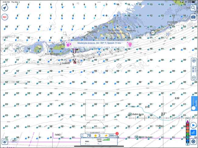
Fig 4 Aqua Map showing a text box pop up with a finger tap in Hawk Channel
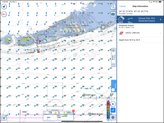
Fig 5 Result of tap on text box in Fig 4
Aqua Map also provides a point weather prediction. Tap on the screen and a text box will pop up showing local conditions. The example in Fig 4 shows a Moderate Breeze, Dir 80 T: Speed 11 kts. when tapped in the Hawk Channel. Tap in the middle of the text box and you get Fig 5.
Fig 5 shows a selection of options at the right, one being the weather. Tap on the blue weather box to get Fig 6 on the next page.
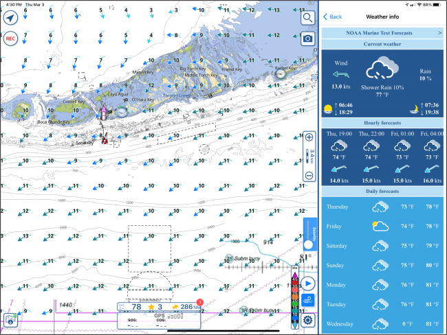
The forecast is just an overview but look at one of the selections – at the top is NOAA Marine Text Forecasts, tap on that.
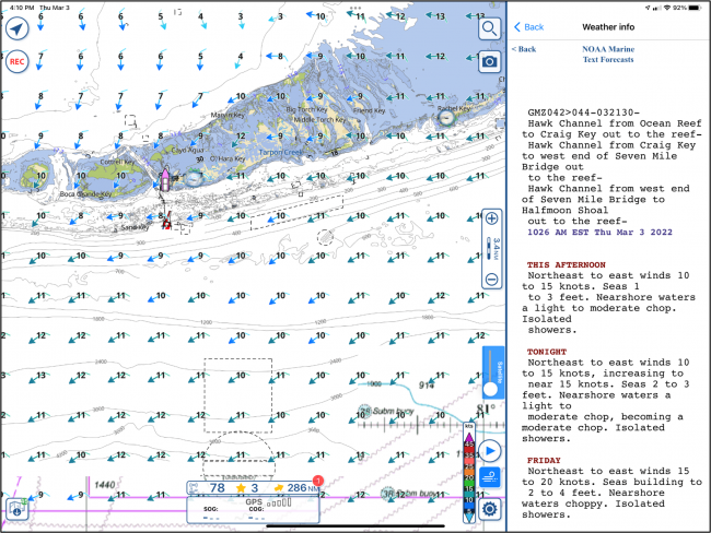
In Fig 7, the NOAA 5-day marine forecast is displayed. Aqua Map shows the NOAA forecast for the location on the chart where you tapped. I tapped in Hawk Channel so it showed the Hawk Channel forecast. If I had tapped farther out, in the Straights of Florida, it would have shown the marine forecast for that area.
The NOAA marine forecast scrolls up so you can see the entire 5-day forecast.
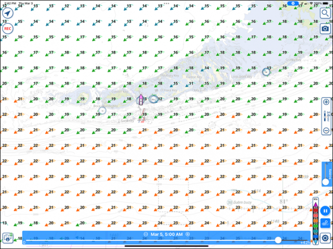

Fig 9 Color legend
With a tap on the prediction slider (the sideways blue triangle), you can see the HRRR prediction for wind. In the example, I advanced it to March 5 at 5:00 am. Looks like some wind is coming. It matches up pretty well with the NOAA marine text forecast of 20 to 25 kt winds (HRRR shows the average wind) out of the east. Fig 9 shows a detail of the chart legend for wind speed.
What about waves? That’s next. See Fig 10.

Fig 10 Wave Display
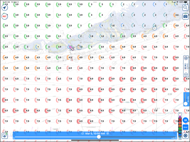
Fig 11 Wave Prediction for 2/5/2022
The icons show the wave direction and the numbers show the average wave heights as of 3/4/2022. You probably don’t want to go east in the predicted weather shown in Fig 11 and Fig 8 for Saturday, 2/5/2022.

Fig 12 Ocean Currents
The display in Fig 12 shows ocean currents with an arrow (color-coded per the legend at bottom right) and a number showing the speed in kts. You can see just how far from land you have to go to get the eastward speed assist of the Gulf Stream. The prediction slider also works with the ocean current display so you can see how the ocean currents are predicted to change with time.

Fig 13 Gulf Stream currents off Miami
The chart in Fig 13 shows the Gulf Stream between Miami and Bimini. Using the icons at bottom right for wind and waves, you can use the prediction slider to see conditions up to 48 hours in advance and determine if there is wind against current conditions and the size of the wind-driven waves – and just where the edge of the Gulf Stream is located.
One other feature that’s important is the ability to color-code speed for any of the three options: wind, waves, or ocean currents.
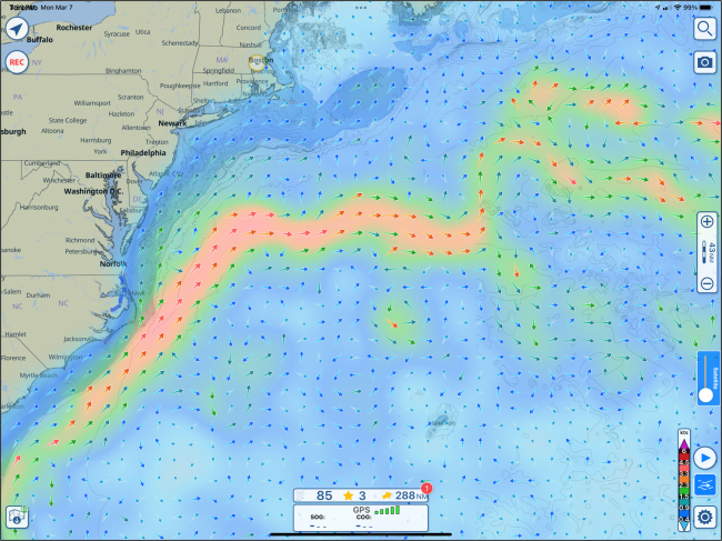
Fig 14 – Gulf Stream in color
In the example in Fig 14, the color-code option is selected for ocean current speed to show the Gulf Stream as it meanders northward in the Atlantic. It’s handy for a general sense of when you will encounter it when heading south from New England to Bermuda or the Caribbean. You can zoom in to find just when the current will be seen on your route. This chart is also a reminder that the wind, waves, and ocean currents display, as well as forecasts, are a worldwide feature. Turn on the color option, select wind, waves, or ocean currents, and pan across the world to see global weather. This is remarkable for quickly finding storms and currents when you’re crossing oceans.
The features all come as part of the Aqua Map Master subscription. In this modern world of weather modeling, why not have as much data as possible at your fingertips? Time on the water is supposed to be fun, who needs the stress of the unexpected – when it can so easily be anticipated?
The new Aqua Map functions will be released on March 15, 2022 in the Master version of the app. For details contact: support@globalterramaps.com.


- 4,000 Marinas
- Thousands of anchorages
- Updated Charts
- Mile-by-Mile Navigation
- Highlighted Alerts & Cautions
- Full-Color Aerial Photographs

The Waterway Guide App Makes it easy to leave reviews, use our explorer, and view waterway guide materials all on the go!